
If you are looking for better yet simple ways of prioritizing tasks, with the added bonus of making better decisions, the 2×2 matrix is the answer. You can use it in planning, roadmap sessions, retrospectives, you name it.
In this blog, I’ll explain the 2×2 matrix, what it is, and how to use it to converse with your stakeholders and make better decisions in your teams. We’ll also discuss how to create one for yourself, as well as the pros and pitfalls.
If you’d rather watch a video than read, you can check out my YouTube video on this topic:
What is a 2×2 matrix?
A 2×2 matrix is a visual framework for prioritizing tasks or projects, with the goal of helping you decide what things you want to work on. It consists of 2 axes or dimensions that you choose to contrast. You probably have heard of the most famous one, the Eisenhower Matrix, that contrasts importance with urgency.
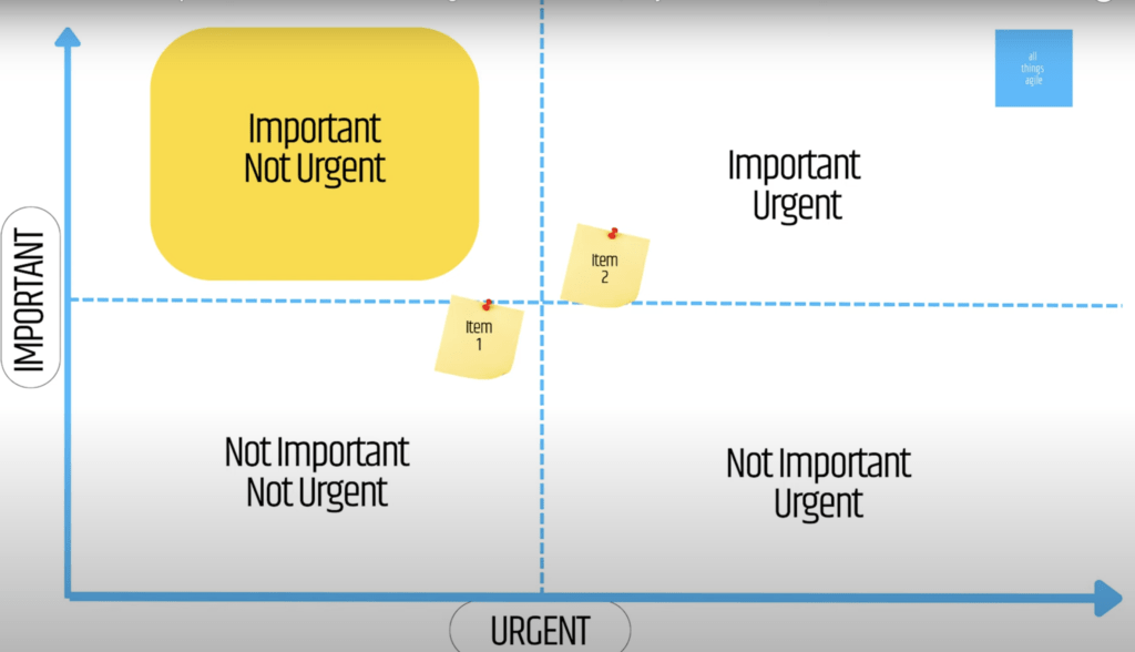
Importance is how much value your work will create for your customers, users, or business goals. Urgency is how soon your work needs to be done either because of deadlines, dependencies, or market opportunities.
If we start with the lower quadrants, you have the not-important/not-urgent stuff. This is a no-brainer – just don’t do it!
If something is not-important/urgent, maybe consider delegating. Maybe that piece of work doesn’t belong on your plate.
Important/Urgent requires that you do that task now. You want to work in a way though that nothing is really placed as very urgent, as you don’t want to have urgent stuff all the time.
Important/not-urgent is the sweet spot. It is where you want your work to land as it allows for sustainable pace.
Why use a 2×2?
#1: Its visual
It is a clear representation of your work priorities. You can see the project and the tasks you have waiting for you in each quadrant. You get to see that maybe you have way too many urgent things and need to consider what to do about it. Or you get to understand that certain values and perceptions might be too inflated.
#2: Its interactive
It’s a very cost-effective way of playing with priorities. All participants in a discussion get to move or pitch in the importance of each quadrant and the placement of items. Which leads o the next point.
#3: Nuance and negotiation
A 2×2 and it’s items is not something that is fixed and that you place on a wall never to touch again. In fact you can and should use it as a conversation. When some stakeholder sees their item is considered too costly, they will be mobilized to figure out how their ask can become lighter and therefore have better chances of winning the prioritization battle.
#4: Alignment
It helps to align with stakeholders on what matters most and why. You can use it to communicate your priorities and trade offs, and get feedback and buy-in from your customers, users, managers, or sponsors. The more people see it, ideally at the same time, the more they get to interact among themselves. Exposing tradeoffs shouldn’t be an alone battle for a product manager or any lead.
#5: Adapts to changing needs
You can use the matrix to review and update your priorities regularly, based on new data, feedback, or market conditions. You can also use it to identify new ideas or opportunities that may have high impact or urgency.
How do you create a 2×2?
I’m glad you ask! It’s pretty simple.
Start by drawing a grid with 4 quadrants on a whiteboard, paper, or online tool like Miro. You need to pick two contrasting criteria that you think will help make the best decision (eg. urgency vs. importance), but it could be anything like value, effort, cost, etc.
Then you want to analyze what each of the 4 quadrants seem to mean. Only then you have a canvas where you can place your work items, ideas, or whatever you need to prioritize. Where things land will inform your decision.
To show you what it could look like, I’ll give you my best effort on an Eisenhower Matrix:
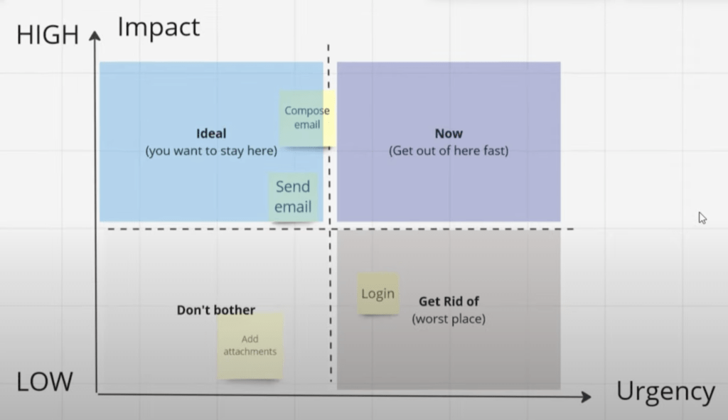
I like to have expressive nomenclature, but that will be something you define with your client, stakeholder, or whoever you are working on the prioritization with.
For example, High Impact and Low Urgency is the land where important things can be scheduled and worked on in a nicely and timely manner. That’s why I like to call it Ideal, or Schedule. To have that visual aid as soon as some work lands there.
Now things that are Important and Urgent are actually a problem. You need to do them now, but it’s clearly a space you want to get out of as soon as may be. Can you imagine how hard it’s to be operating on high priority tickets all the time?
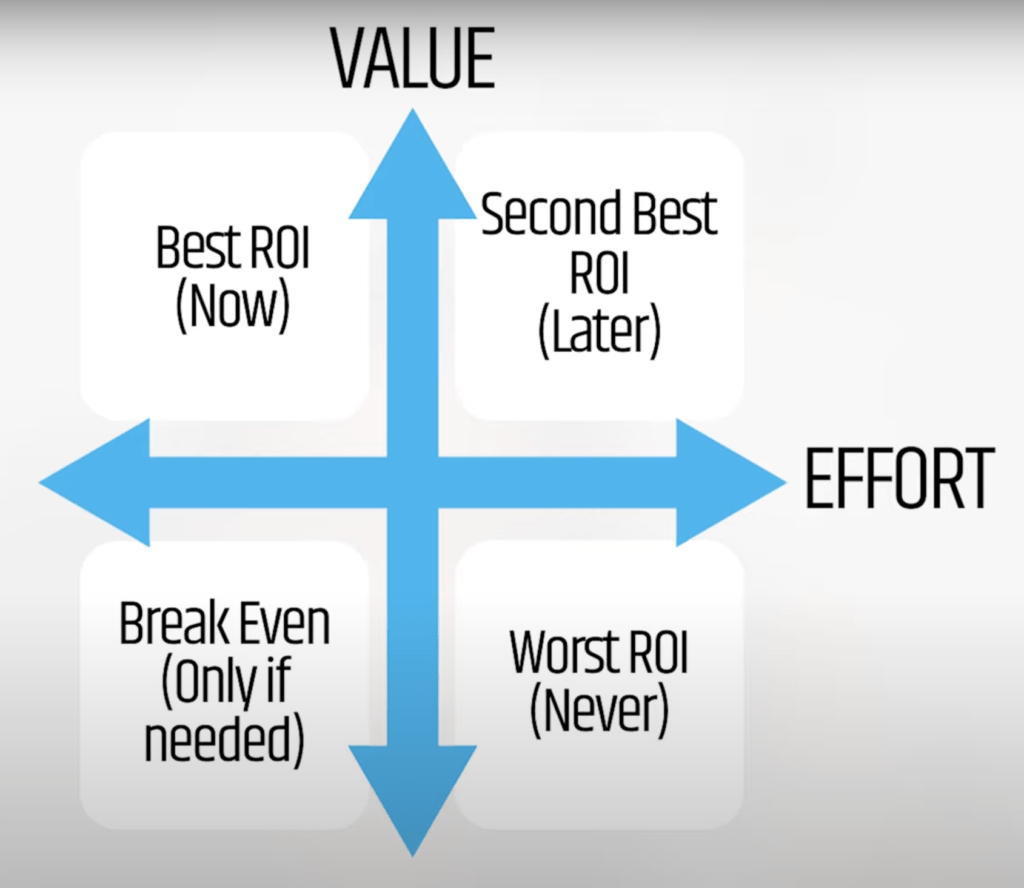
This is another example of one I like to use, especially when time is not an issue. This one contrasts the value vs. effort. In this one, you can see what really has a great ROI vs those things that aren’t worth bothering with.
Spicing it up
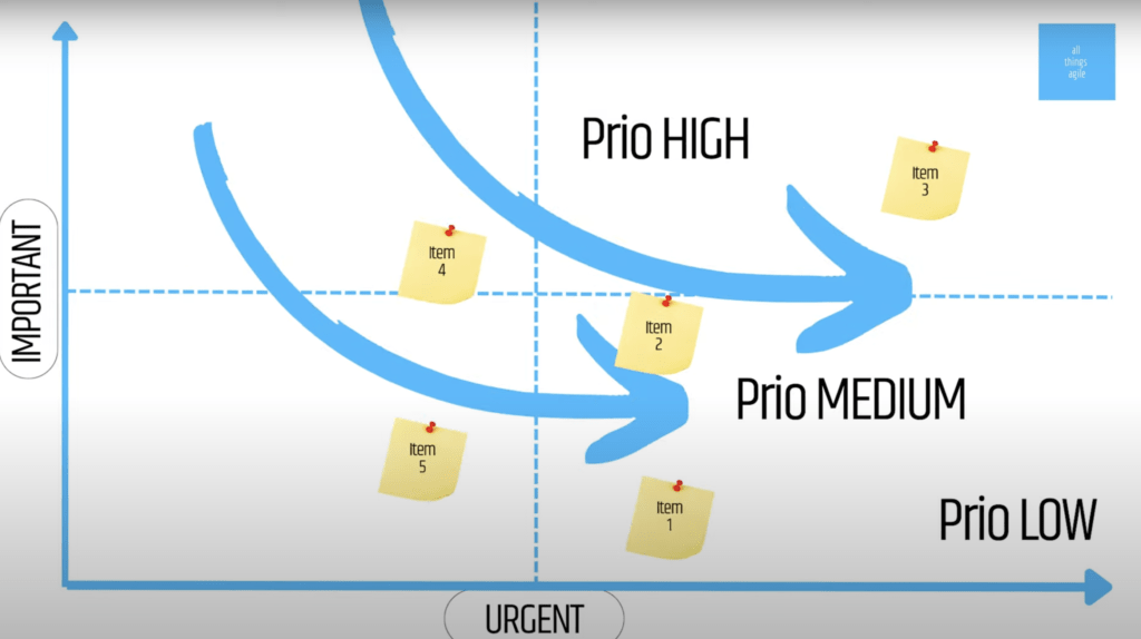
While the quadrants say a lot, the important discussions end up happening at the boundaries. So for instance, what should we do when something sits on the line of importance?
One thing we can do is consider the relative importance of each item and re-evaluate their positions. You don’t think about the tasks in isolation but in relation to each other.
Another approach is to refine the criteria used to evaluate each item to reassess their placement in the matrix. Maybe add another criteria or decide what part of the customer journey that user story truly belongs to and that could lead to a different positioning in the matrix. One example could be, add yellow dots or red dots on your tickets to mean something extra. Right there it became the third dimension of the canvas.
Another option is to add hot zones and specific boundaries in the quadrants. What I like about this is it makes it clearer as far as the priorities. It’s almost like adding a third dimension as well! You can then color-code those sections so that visually you know you want to get out of the hot zone.
I’ve used 2x2s in product roadmap sessions and refinement sessions where you are trying to understand the relative importance of things.
The essence of the 2×2 is clarifying, helping you make more informed decisions and understanding priorities. The tool is not magic though, it’s only an aid, but it will help steer the conversations in a more focused direction. Which leas us into the next section.
The Pros
#1: Easy to create and simple to use
All you need to do is draw a grid and decide on your criteria. You can literally do this quickly on paper, whiteboards or post-its.
#2: Flexible and customizable
You can adapt your criteria according to your needs and goals.
#3: Visualize your priorities and tradeoffs
You can see which options are high or low and can easily compare.
#4: Make decisions from a logical place
It’s not perfect, but you can assign weight or scores to each option and then calculate the best one.
#5: Align stakeholders on what matters most and why
You can use the matrix to communicate your rationale and get feedback and buy-in from your customers, users, managers, or sponsors.
The Pitfalls
#1: Doing it alone
A 2×2 is supposed to be a collaborative tool. It requires input and feedback from multiple stakeholders. If you do it alone, it may result in biased or incomplete perspectives and may also reduce the buy-in from others.
#2: Choosing arbitrary or irrelevant criteria
The matrix is only as good as the criteria you select. Choosing irrelevant criteria may lead to misleading or inaccurate results and may also overlook some important factors that affect your decisions. For example, if you have no info about cost, don’t use cost as one of your criteria.
#3: Relying too much on subjective judgements
Although a 2×2 can help us with thinking logically, we still pass some sort of subjective judgment. It is only as good as the quality conversations you are able to maintain with the people you are working with. Relying too much on subjective judgements could introduce errors or inconsistencies, and may also ignore some quantitative data that could support the decision. It could oversimplify the situation. Remember it only offers 2 dimensions at a time. You could miss opportunities or risks that arise from the interactions of multiple variables.
The 2×2 is not only for planning
Despite the pitfalls, the 2×2 matrix is a great thinking tool and it can sometimes be THE activity for you to do in a retrospective. Here’s a real example I did on a work session where we were looking into items of the technical debt backlog:
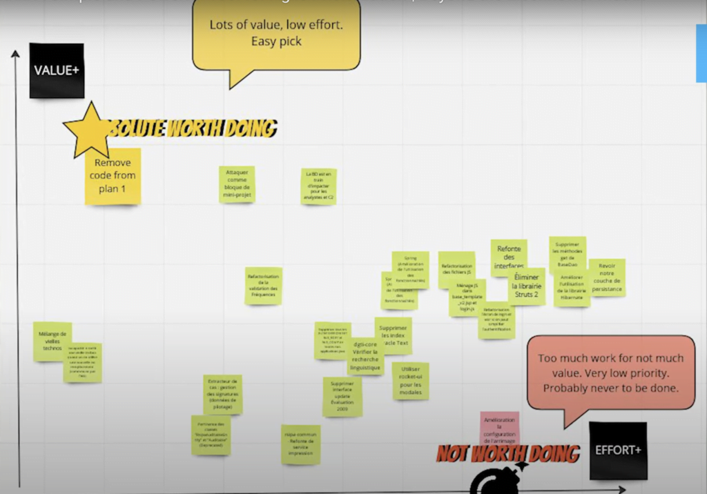
We were deciding which items we should attack or not and how to proceed. While there was a pile of items for us to sort through, what was important here was to determine the “for now” piece. What are the things we won’t do at all and what we should start doing. We don’t have to worry about prioritizing all 20 items on the list, but we just discuss enough to discover the next best part.
Once we are done completing the yellow one that is the highest priority, we can take another look and rearrange. Sometimes just by working through the items you selected that should be worked on first, will naturally displace other items in the matrix.
Remember to use the 2×2 matrix as a thinking tool for collective negotiation. It isn’t automatic or magic. Experiment a bit with different approaches, adding other dimensions, boundaries, and transforming the whole canvas into something that is your own.
If you are interested in growing your agile skills, other than the blog and videos, consider joining the newsletter Agile Circle. It’s totally free, and you’ll receive insights in your inbox, be invited to events and workshops in our community of practice, The LAB of All Things Agile, and get first word in discounts for our paid programs and coaching.


